APEX Catalog
Helping users find the right cloud offers and solutions
APEX is Dell’s Cloud Platform offering mostly private and hybrid cloud solutions. They are looking to expand their catalog of offerings and with that comes scalability challenges with the current platform’s designs.
The Challenge
As multiple APEX offers are onboarded to the Console, users need an easy and intuitive way to browse a list of all the available offers and can configure/subscribe to with minimal clicks with appropriate permissions.
The catalog page should be designed in such a way where more services can be added and displayed on the page with appropriate meta datas they become available without needing a redesign of the page.
This assumes the availability of at least 3 or 4 offers to start with: APEX Data Storage Services, APEX Hybrid Cloud, APEX Private Cloud, and Dimension (with more to come.)
The Scope
Each offer listed in the catalog should follow a consistent, templatized format. Pseudo-catalog or interim, but eventually designed in a way to support a dynamic catalog in the future.
The Catalog page and associated learn more product pages should be available for all authenticated users regardless of permissions to view and follow the APEX taxonomy structure defined in unauthenticated experience.
The “Subscribe” button should be tied in with appropriate RBAC permissions, where if a user does not have the ability to configure an order, this button will be hidden.
A user with the appropriate permissions should not be more than 1 click away from being able to Create New Draft Order.The catalog page should not have general/high-level (marketing) style content, nor have a promotional/advertisement look and feel to it. The product content should be more technical focused and directly related to the specific offer.
Products should be able to fit on a single page, so users do not have to navigate or click to see more offers.
When user clicks “Learn More”, Console needs the accompanying product pages, content that exists within Console as to not rely on external sources for now, thus requiring some duplication of content in the interim.
What is APEX?
And why work on the catalog?
The Process
Research
Researching Previous Testing & User Quotes
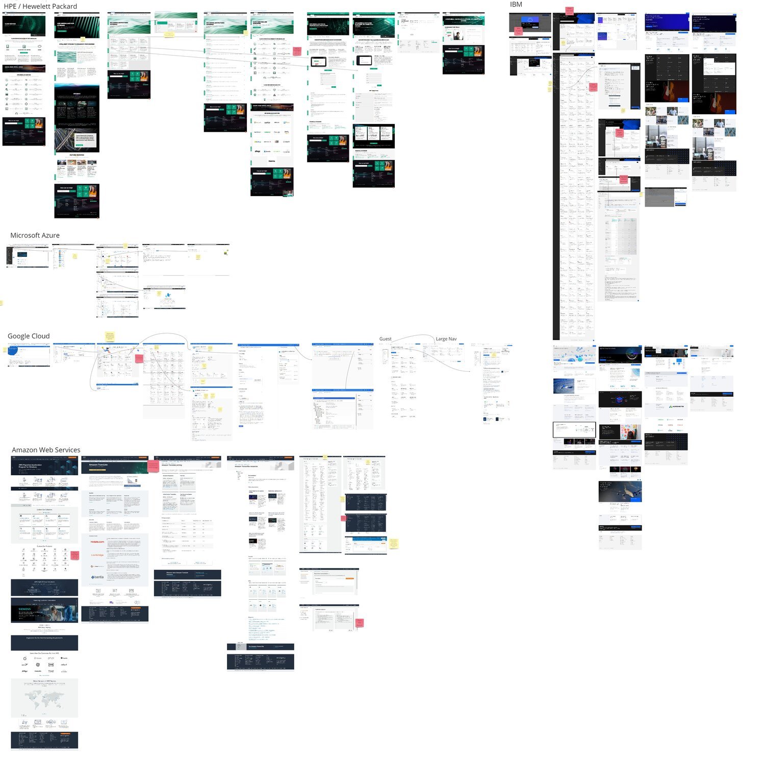
Competitive Analysis
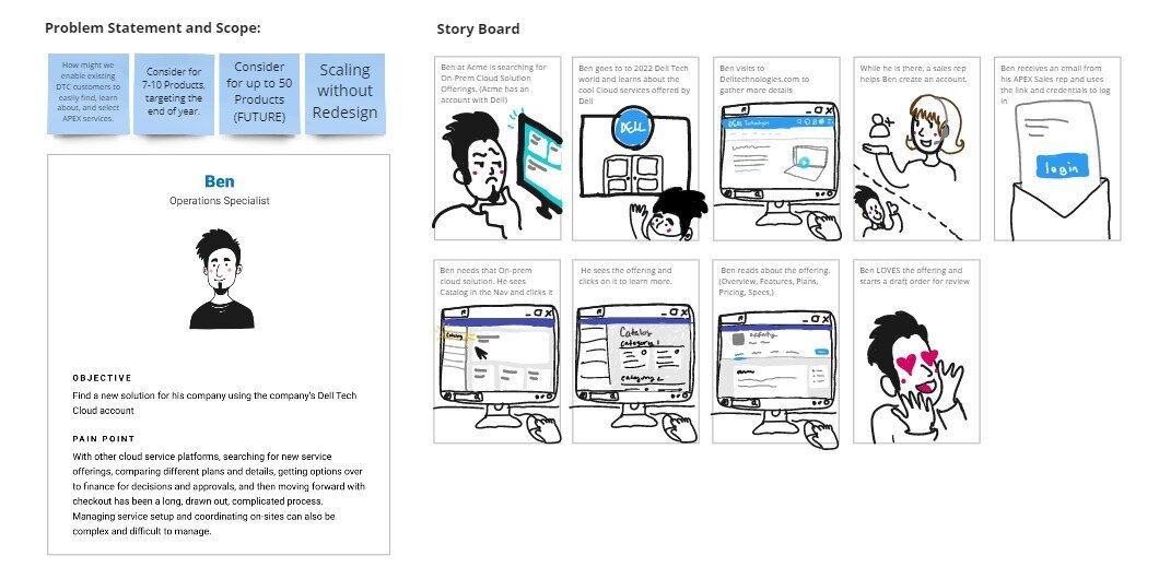
Defining Scope
Lean UX Canvas
User Flow
Storyboard
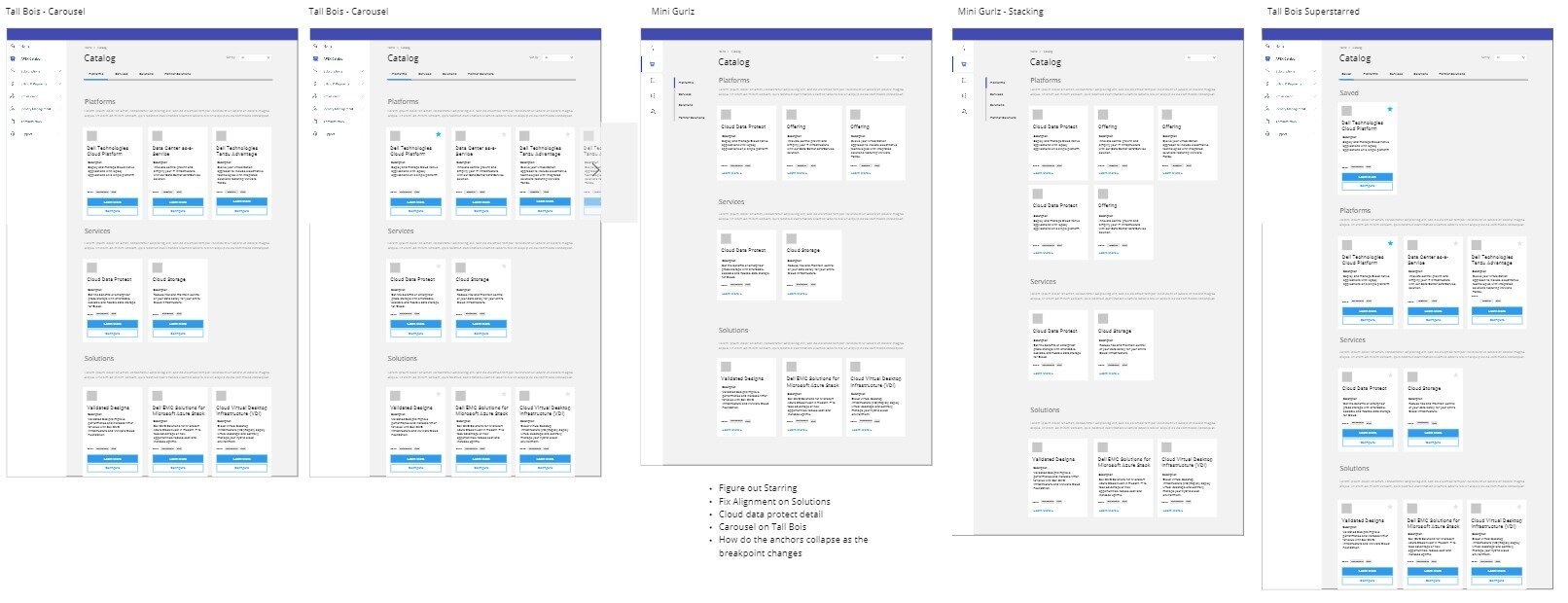
UI Design
Phased approach to designs that build upon each release
Interactive Prototype
Testing & Analysis
Moderated User Tests
Segmented Miro Notes
Grouping based on themes
Recommended Next Steps
Previous Testing
One particular aspect that we wanted to learn more about was how a user might expect to navigate to find where to learn and purchase a cloud product. We saw an opportunity to expand on a current research initiative integrating the side nav and content strategy as a part of the test.
Previous testing revealed that there was no clear indication of where participants expected to make new purchases. Although “Catalog” was the correct answer, only 22% of participants correctly guessed this on their first click. 28% clicked Billing & Finance page, 24% clicked Subscriptions, and 20% clicked Resource Management.
In addition, participants in the study did not find the term “Catalog” as accurate or clear. Users associated the term with something old or analog, not something that fit in with their experience working in the cloud world.
Quotes from the previous test
“I would change the Catalog label to Solutions or something else. The catalog name doesn’t stand out to me. The others are pretty clear.”
“Catalog is not descriptive enough. I would change it to cloud and move the app marketplace.”
“I would call Catalog something different like “offerings.”
Competitive Analysis
To get some inspiration, we gathered screenshots of other cloud platforms. We focused on how cloud platforms were displaying their offerings (how they filtered, sorted, and grouped them) and how a user would learn about different products and purchase them.
Overall Competitive Findings
Tabs/Anchors: Sticky Tabbed structure for product details page was very common
Hero/Visual Header: Visual to cue customer that the Main Category page is the Master table of contents. Some of the sites have a larger visual graphic for the guest customers and just a larger title for the authenticated free trial users
Guided Tour: IBM and Google include nice guided tours of the platform to help users learn about how to get set up and navigate.
Visual Cards: Main Category pages and secondary offering sections include some sort of visual high level product "Cards"
AWS: AWS had atypical patterns including taking a list view of links of the catalog products, and lack of a product details page.
“Try” Buttons: Google and Microsoft have very clear "Free Trial" tagging and language. IBM includes some free trial language but is called "Lite Plan."
Filters as a Sub Nav: IBM replaces the sub nav with filters
Marketplace: Google housed both "your products/subscriptions" and "products/subscriptions for sale" on the same page in Marketplace.
Inconsistent Locations/Nav Environments Across Authentication States: For example, Amazon's Nav and Category page locations vary between logged in or not logged in. Does this cause confusion for our customers who are trying to return to gather specs, code, etc once they purchased the product?
All Filters: Filters for the catalog include:
Category
Type
Provider
Pricing Plan
Compliance
Release
Operating System
Publisher Type
Publisher Name
Most Common Filters:
Catalog
Pricing
Type
Determining what to design
After we finished researching our competitors we came together to determine exactly what we needed to design for the test. We brainstormed on a Lean UX Canvas, outlining the business problem, the users, hypotheses, potential solutions, what to learn first, desired business outcomes, user outcomes & benefits, and quick wins.
Presenting the desired flow and storyboard
After presenting to our stakeholders, we narrowed down the scope and storyboarded a flow.
Our goal was to find out:
How might we enable existing DTC customers to easily find, learn about, and select APEX services.
How might we design a scalable design that would work for the near term of 7-10 cloud products and up to 50 cloud products for the future in a way that would not require a major redesign.
The Designs
We wireframed several iterations of the designs and collected feedback from our design peers, which informed our final designs.
We created a phased approach to the designs outlining how the page would scale as we add more items to the catalog.
Stage 1: Catalog items would be grouped by category with limited sorting functionality
Stage 2: Add recommendations
Stage 3: Personalization Guide & Advanced Filtering.
For the design sprint we decided to test the most future state version, stage 3.
All Offerings (Landing Page for the Catalog)
We chose to go with a catch all name “All Offerings” which we thought would be perceived as more modern and direct than “Catalog.”
We included filtering through the page and through the sub navigation to give users multiple avenues to find the offering they need.
Additionally we added new features such as favoriting, sorting, and an interactive quiz that would walk through which offerings we would recommend based on the problem you are trying to solve.
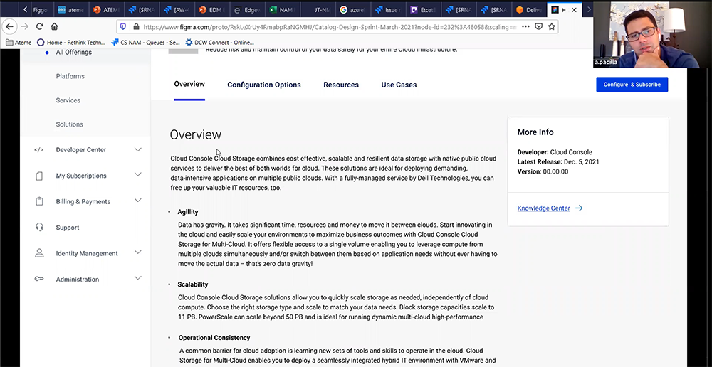
Offering Details Page
For the details page, we included tabs to keep the information digestible. This was a common pattern from what we saw in competitive analysis.
These tabs were sticky and kept the configure & subscribe button always in sight no matter where they had scrolled on the page. We thought the wording of “configure & subscribe” gave the user a more accurate sense of the upcoming steps should they click the button.
We chose the categories of
“Overview” for basic information on what this offering includes,
“Configuration Options” as a sort of “try it out” playground where they can adjust the settings to get pricing and performance information
“Resources” as a place for them to find relavant APIs and a terminology library
and “Use Cases” to help them understand different scenarios where this offering could help them.
Testing
We had a set of questions in mind that we wanted to answer, so we built a prototype to go through a flow where we could ask these questions in context. In order to get specific feedback we chose to do moderated user testing with a mix of generative questions about finding/learning about offerings and costs, as well as usability questions around the layout, content, nomenclature and functionality.
We started with intro questions, then moved on to the prototype and dived into navigation related questions on the home page, main catalog "Marketplace" page and Offering interior pages (Overview, Resources and Configuration Options). We then closed with some follow up questions about the overall experience.
The users we talked to were familiar with the cloud world and consisted of roles such as, Infrastructure Manager, Sr IT Manager, and Director of Procurement and Technology and Strategy.
What we wanted to learn:
How does user find & learn about cloud offerings & costs?
Does the organization of the catalog/interior pages make sense? Do we need any adjustments?
Does the content include everything the customer needs to shop for cloud offerings (Catalog + Interiors)? Do we need any adjustments?
Verify accuracy of nomenclature “Marketplace” (Vs. Catalog)
Do customers understand Side nav labels for Platforms, Services and Solutions?
Secondary Questions (Time Permitting):
Do customers understand subscription pricing.
Gather feedback on the filter right hand drawer.
Gather feedback on if and how users would want to sort through the catalog
Learn how customers interpret and expect to interact with tags.
Determine if and why a user might want to return to the catalog details pages or to a saved offering.
Find out where users think API Marketplace would live?
User Testing Notes
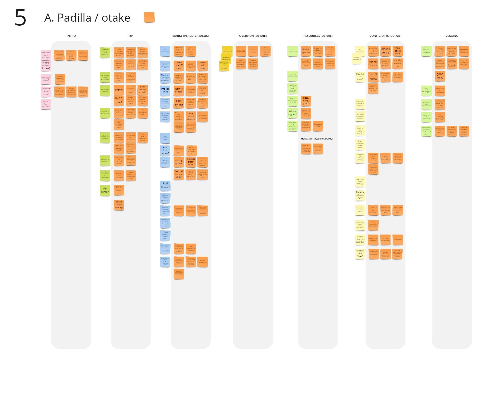
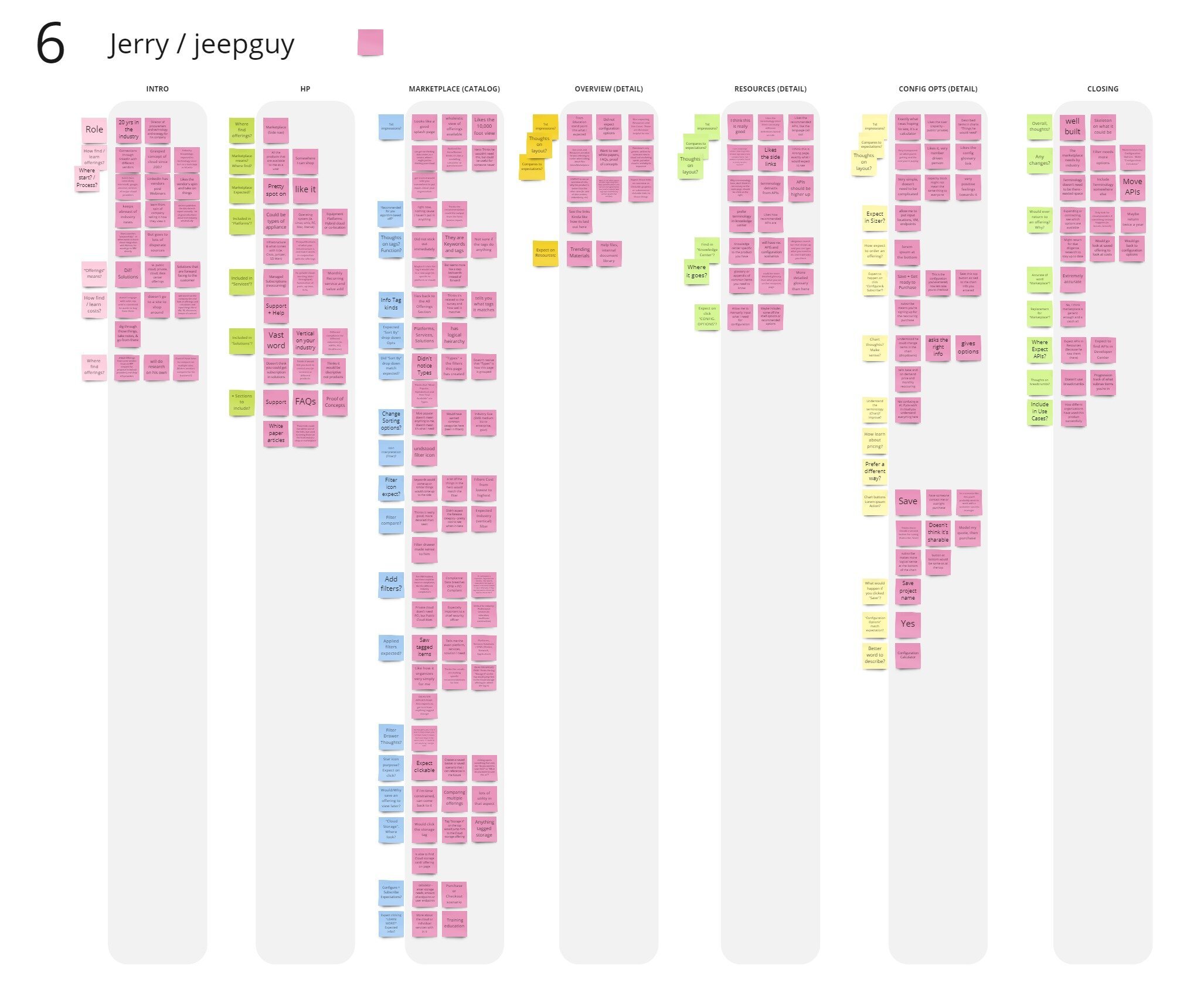
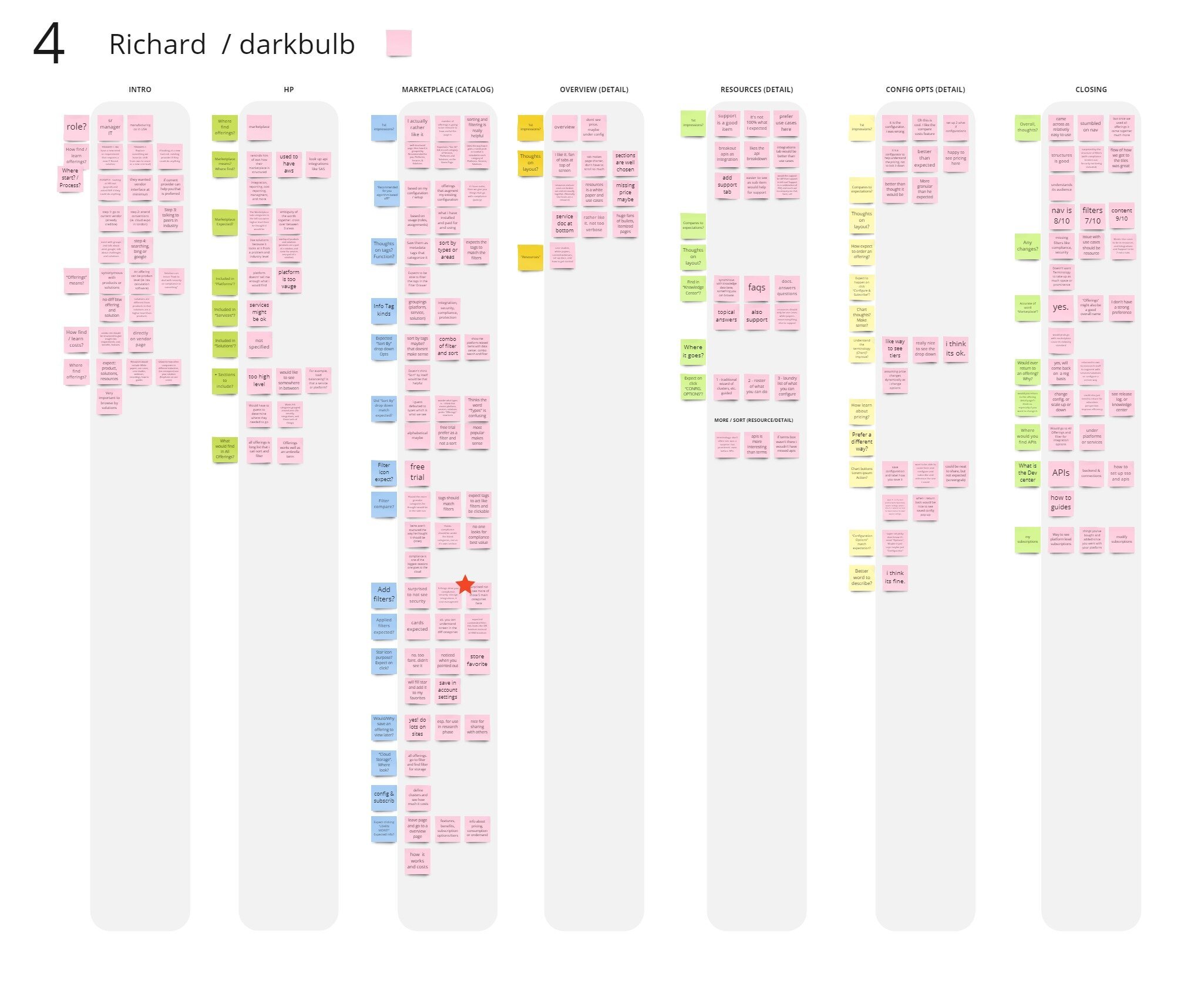
As a two person team, one of us would conduct the moderated user test and the other would take notes in Miro that were divided by categories of intro, each of the pages in the design, and closing thoughts. We used a different sticky note color to distinguish between the users that we tested.
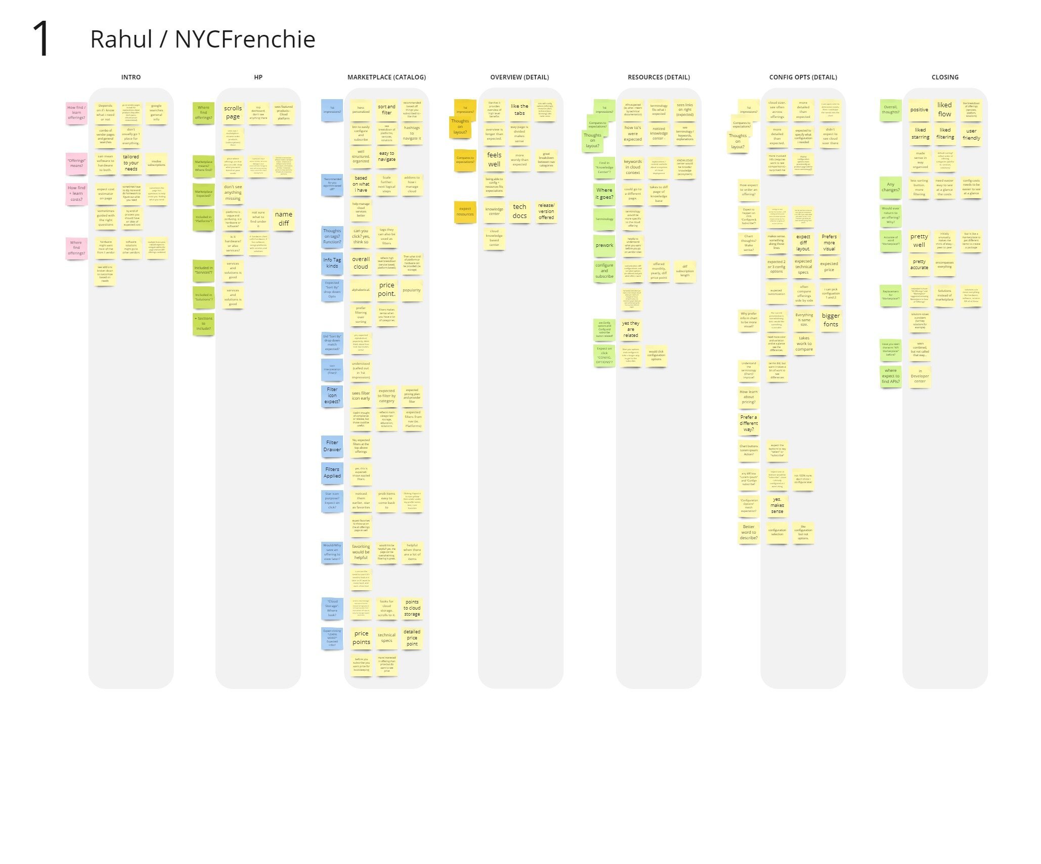
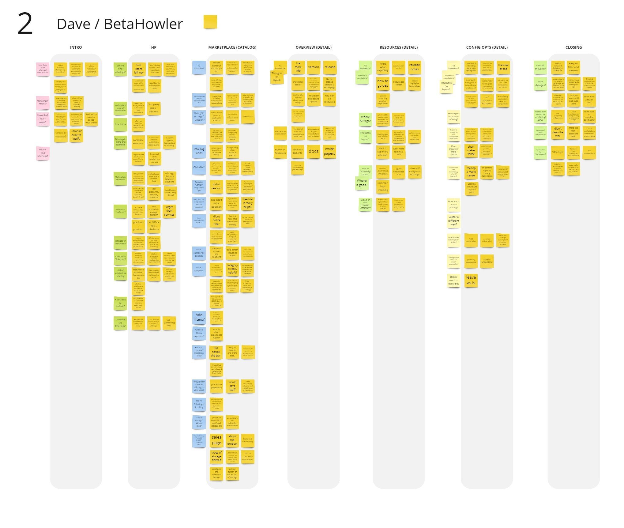
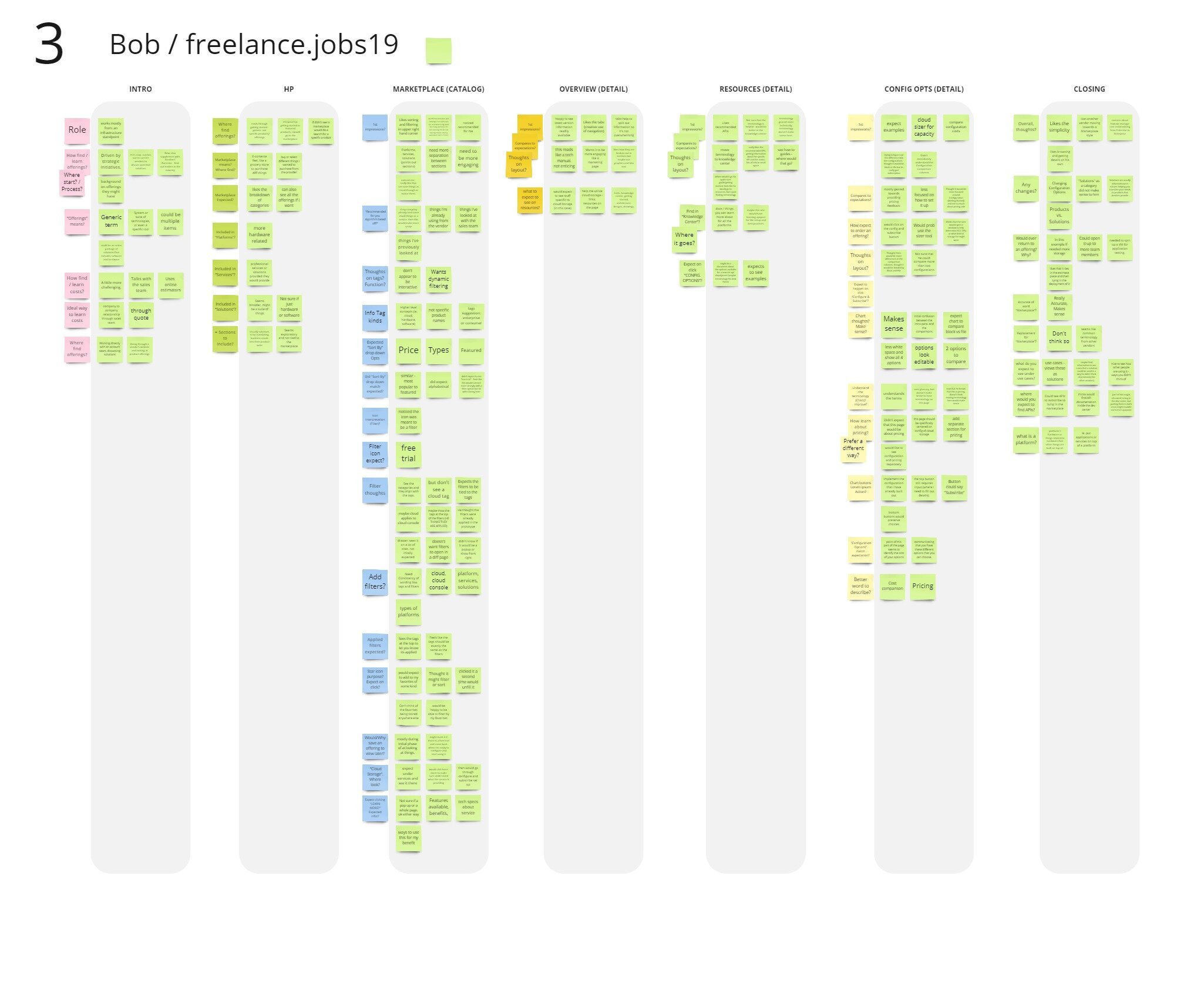
User Testing Analysis
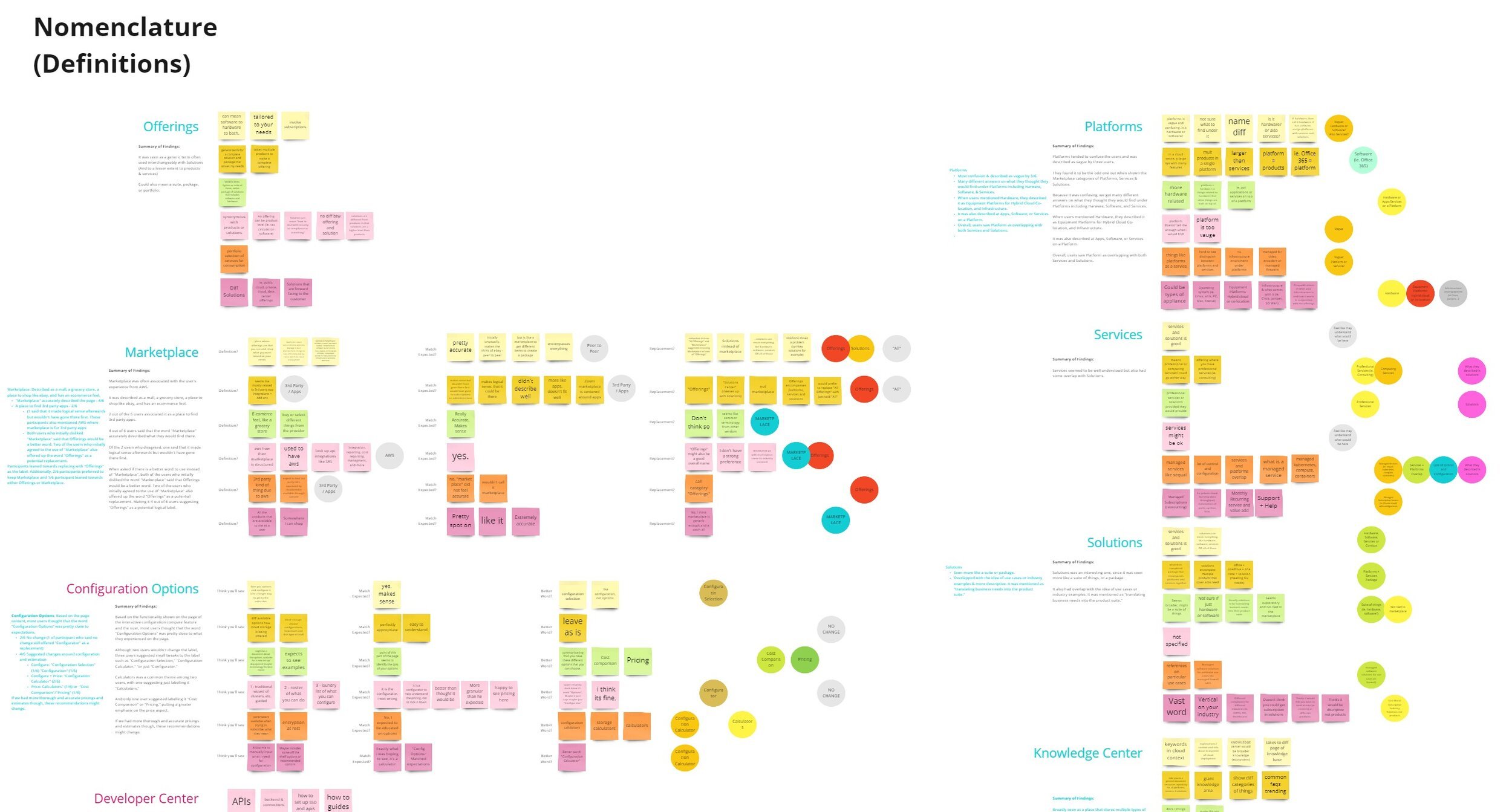
After finishing the user tests and notes, we took those notes and grouped them by themes to see if any trends were forming.
Main Themes
We identified the largest buckets as our main themes we wanted to learn more about. This included:
The process of finding and learning about offerings
Nomenclature
Interactivity
Content and Layout
Smaller Buckets
Within those, we grouped smaller more specific buckets. Here we could see each of the users feedback and how they compared. Depending on the question, we could see their progression from what they expected to see, the first impressions, and if they would make any changes. We’d then write a summary of our findings on the left.
User Test Findings
How do users learn about and find cloud offerings?
Participants sited multiple ways of learning and finding about offering, including:
Search (5/6)
Vendor Pages (3/6)
Contacting Current Vendor (2/6)
Researchers (Gardner & Forrester) (2/6)
Conventions/Expos (2/6)
Others: Contacting Vendor, Vendor Emails, Webinars, Verizon Data Breech, Peers
Depending on what they need, they might initially start with pre-work searches. Then, if they have a good existing relationship with a vendor, they might reach out to them first for new offerings. If not, they learn about what's available through several of the methods noted above, and then either reach out to the potential vendor or visit their web page for offerings.
All 6 participants expected to be able to learn about pricing on the vendor's site, and expected to learn about it via:
Vendor Cost Estimator (4/6)
Vendor Pricing Table (2/6)
Costs on page 1/6
Navigation and Nomenclature
Marketplace: Described as a mall, a grocery store, a place to shop like ebay, and has an ecommerce feel.
Participants leaned towards replacing with "Offerings" as the label. Additionally, 2/6 participants preferred to keep Marketplace and 1/6 participant leaned towards either Offerings or Marketplace.
Offerings: Seen as a generic term often used interchangeably with Solutions (And to a lesser extent to products & services). Could also mean a suite, package, or portfolio.
Although this was not included in the script, 2 participants noted "All Offerings" + "Marketplace" redundancy caused confusion, and reducing to "All", or simply clicking Marketplace would help
Platforms
Most confusion & described as vague by 3/6.
Many different answers on what they thought they would find under Platforms including Hardware, Software, & Services.
When users mentioned Hardware, they described it as Equipment Platforms for Hybrid Cloud Co-location, and Infrastructure.
It was also described as Apps, Software, or Services on a Platform.
Overall, users saw Platform as overlapping with both Services and Solutions.
Services
Services seemed to be well understood but also had some overlap with Solutions.
Solutions
Seen more like a suite or package.
Overlapped with the idea of use cases or industry examples & more descriptive. It was mentioned as "translating business needs into the product suite."
All Offerings / Catalog Landing Page
The first impressions were very positive. They liked the layout saying it was easy to navigate, made sense, and liked the groupings that gave a sneak peek into the categories (which helped their understanding of the categories.)
There was some interest in the "Getting Started" hero, as well as the star icons and the sorting/filtering.
Suggested Changes:
One user expected the filters to go across the top
Another user requested more spacing between the sections and that it needed to be more engaging.
One user expected to have a "See All" link in each of the categories.
Tabs
The tabs themselves were well received. Users liked how it broke down the content into more digestible sections.
Two users initially said that the tab categories were well chosen.
Mostly the only tab label that they thought could be changed was "Configuration Options." But we also specifically asked about that label and if they would change it. Some confusion was also caused by the nearby "Configure & Subscribe" button.
Resources and Use Cases were seen as the most helpful tabs for our users.
One user expected to see Pricing as a tab but figured that it would be under "Configuration Options."
The same user thought that Use Cases should be under Resources. He wanted the recommended APIs on the Resource tab to be moved to their own tab called, "Integrations. He also recommended that "Support" become a tab as well.
Overview Tab
The overview matched their expectations in that it was educational content, but they anticipated it to be more marketing content based.
Even with the bullet points and highlighted features though, it was generally considered too verbose. Users wanted more engaging content like images on the page.
Resources Tab
Generally, users highly valued the recommended APIs, especially over the Terminology accordion which they said could be helpful for those who are new to cloud but not to them specifically as experienced cloud users.
Aside from the Terminology and API info on the page, users suggested having more technical info, more getting started info and possibly including use cases in this tab.
Configuration Options Tab
One user did not expect the sizer here, but it was generally appreciated on the page.
There was a bit of a split as to those who liked having a highly interactive configuration comparison chart and those who wanted more static information (or just recommended packages.)
Two users wanted clearer pricing ("Total") and for it to be called larger out more and/or separated.
One user wanted a more visual configurator, rather than a chart with drop downs.
One user did not seem to understand the chart, misunderstanding the columns. He wasn't sure if he would compare more than two configurations.
One user really liked the chart and comparison aspect calling it "better than expected."
One user expected more static info and just wanted definitions of the available configuration options.
One user was very enthusiastic about the chart, saying how much he likes calculators and playing with numbers.
Based on the page content, most users thought that the word "Configuration Options" was pretty close to expectations. If we had more thorough and accurate pricings and estimates though, these recommendations might change.
Recommended Changes
Platforms, Services & Solutions
These all seemed to overlap quite a bit and caused some confusion. Could these be tags/filters so that a multiple could apply?
Not sure how helpful these designations are, seemed like there was more interest in the Filter Categories. Maybe those could have more emphasis rather than these larger buckets? (Note: We tested with 21 Offers, so our results are likely biased by the amount of offers shown. At what point do they become meaningful?)
Additional Recommendations
Filters were incredibly helpful, but the filter icon wasn't noticed by half of the participants. May want to adjust the styling & run a test against an open filter nav.
Move "Free Trial" from Sort to Filters.
Make sure the tags are reflected one to one in the filters.
Address the "All Offerings" & "Marketplace" naming problem.
Replace "All Offerings" with "All" or "See All" in the nav.
Expand recommended APIs in the Resources tab.
Reduce the terminology chart to a link.
Reduce text on the Overview tab, as well as include images or ways to make the content more engaging. Maybe including the expected marketing content here.
Explore what the Catalog page could be like from a more Solutions standpoint, such as showing use cases, or organizing things by industry.
House API Marketplace in the Developer Center.
What’s Next?
This Design Sprint served as the basis for the Catalog design effort and greatly sped up the process of implementing the catalog in APEX in time for Dell Tech World. It also solidified the next steps for the navigation on the platform as a whole.
